Learn
How to Best Focus Your Effort
Using the National Poverty Plan Standards (NPPS), we estimate that nearly 82 million people in the United States are not able to live for a sustained period of time without assistance. In contrast, the U.S. Census Bureau estimates that 38 million Americans live in poverty.
Why the discrepancy? Our income standards account for geographic differences in cost of living and changes in spending patterns since the federal poverty guidelines were first enacted.
Find out more about our income standards and use the interactive maps and charts below to identify areas with the highest concentration of people living under the income standards. Explore a variety of indicators to help you target your actions in the areas of highest need.
NPPS
National Poverty Plan Standards
Our income standards consider local costs of living and more accurately capture economic need than the federal poverty line. The standards are based on 50% of local median income, adjusted for household size. Learn more about the methodology we used to develop the income standards.
Hover over a state in the map below to discover how many people in that state fall below the NPPS. Click on the state to access a downloadable file that contains county-specific thresholds that answer the question: How much does it take to get by in your community?
Darker states have higher numbers of people living below NPPS.
Explore the Data
Explore the data below using the built-in controls within the dashboards. Tabs at the top of the display facilitate quick movement between the tables, graphs, and charts. Use the icons at the bottom of the data window to share or download a selection of the data and graphs or to enter full-screen mode.
A description of the indicators is beneath the data window. Be sure to cite The Shared Humanity Project and include a link to this page when using the data and graphs in your own work. The data is best viewed on a desktop in full-screen mode. Select the ‘full-screen’ option in the bottom right-hand corner of the data window.
If you have trouble viewing the data on this page, you can also access it here: https://bit.ly/NPPS2021
For more information about how to use the data, consult the User Guide.
Understanding the Data
The data dashboard demonstrates the scope and the geography of economic need in the United States. The charts and graphs suggest areas–both geographic and substantive–where you might want to focus your actions. The majority of the data is provided at the neighborhood (PUMA) level and you can choose to explore a single or group of areas, counties, and states. Learn more about the data and the methodology we used for the analyses. The User Guide includes more information about how to apply the data.
The dashboard includes the following charts and graphs:
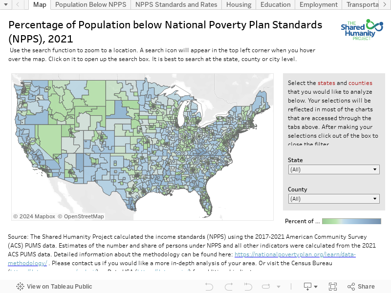
The Map
Illustrates the percent of a neighborhood’s population living in households with incomes below NPPS. A tooltip summarizes the income standards for different household sizes and the estimated number and percent of people living below the income standards. The area’s PUMA number is included in the tooltip so you can find additional indicators for the area at the Census Bureau or Data USA websites. Use this graphic to determine what neighborhoods throughout the country have the highest percentage of people living below NPPS.
Population Below NPPS
Depicts the county-level share of a state’s or group of state’s population with incomes below NPPS. Use this information to determine what county in your selected state(s) has the highest number of people living in households with incomes below NPPS.
NPPS Standards and Rates
The first table shows the NPPS, by household size, for every county in your selected state(s). The second table displays the number and percentage of the population below both the NPPS and the federal poverty line by neighborhood (PUMA).
Housing
Two graphs and five indicators: rent exceeds 33% of income; rent exceeds 50% of income; moved within the last year; % of vacant housing units; home ownership (owned without mortgage, owned with mortgage, rented). Bar colors for the first four indicators depict the relative percentage of the population below NPPS for the selected geographic area.
Education
One graph with four indicators measured for adults aged 25 and older: Did not graduate from high school (HS); HS graduate or higher; Associates Degree or higher; and college graduate or higher. The last three indicators are not mutually exclusive. Bar colors depict the relative percentage of the population below NPPS for the selected geographic area.
Employment
Two graphs and four indicators. The first graph shows the percent of the population aged 16 and older who are: unemployed; not in the labor force; employed. Bar colors depict the relative percentage of the population below NPPS for the selected geographic area. The second graph shows the distribution of workers by weekly hours of work (less than 30, 30-39, 40 or more).
Transportation
Two graphs and four indicators for workers who work outside the home: commute at least 30 minutes; commute at least 45 minutes; commute at least 60 minutes; and use of public vs private transportation. Bar colors for the first three indicators depict the relative percentage of the population below NPPS for the selected geographic area.
Access to Technology
One graph with two indicators: access to high speed internet and access to a computer. Bar colors depict the relative percentage of the population below NPPS for the selected geographic area.
Health Insurance, SNAP, and Disability
Two graphs and four indicators: disabled; has public health insurance; has private health insurance; household receives SNAP or food stamps. Bar colors depict the relative percentage of the population below NPPS for the selected geographic area.
Presence of Children
One graph with three indicators: any children in the household; only children under age 6 in the household; only children between the ages of 6 and 17 in the household. Bar colors depict the relative percentage of the population below NPPS for the selected geographic area.
Ethnicity, Citizenship, and Race
Two graphs and three indicators: Hispanic (any race); not a citizen; and race (black only, white only, other or more than one race). Bar colors for the first two indicators depict the relative percentage of the population below NPPS for the selected geographic area.
Important Note about Margins of Error
Margins of error are calculated for a 90% confidence interval in the data dashboard. For example, if the NPPS rate for an area is 25.0% (+/- 1.0%), there is a 90% chance that the ‘actual’ rate is between 24.0% and 26%. Margins of error demonstrate both the precision and stability of an estimate. Survey data for small areas (i.e., PUMAs), particularly for indicators that are not very common, can have large margins of error. We tried to balance the selection of indicators for the dashboard to maximize the relevance of the information with the stability and precision of the estimates. Feel free to contact us if you would like to see additional indicators for your area.